We love a challenge
If you’ve got a big idea or a new project in mind, we’d love to help. Let’s chat.
We partner with progressive Kiwi businesses who want to deliver exceptional digital experiences to their customers. Here are some of the ways we’ve helped our clients connect with their customers and achieve big things for their business.
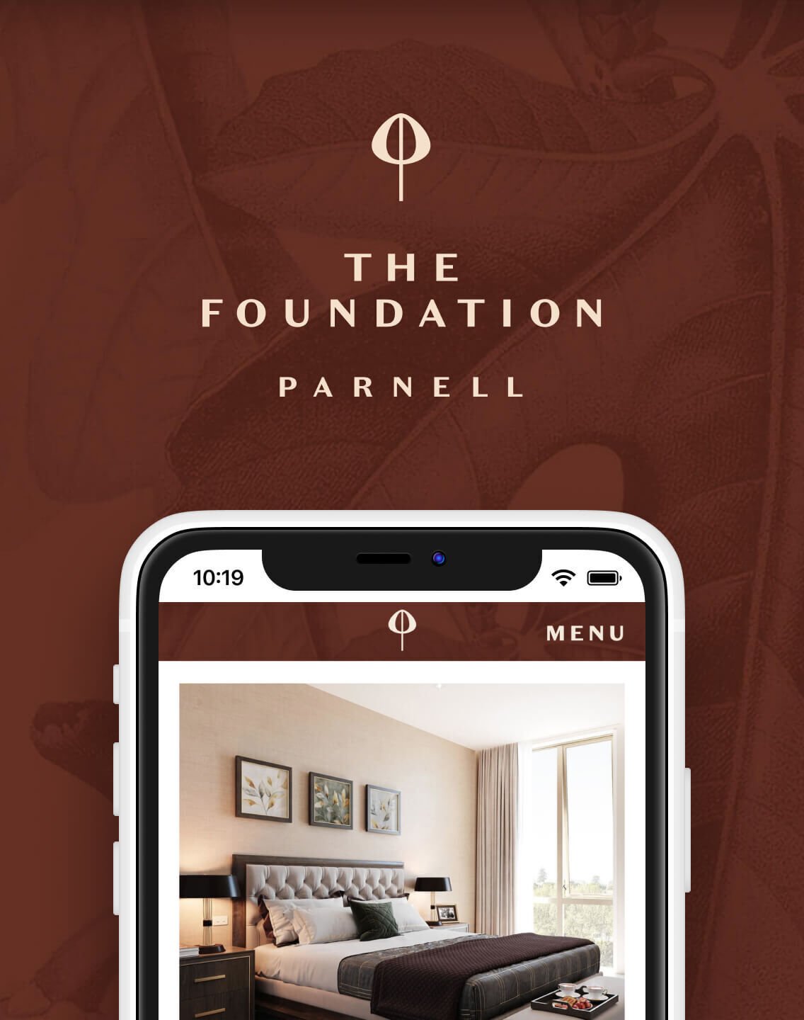
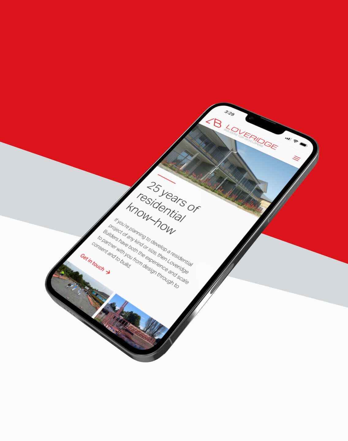
Later Life Luxury - In the heart of Parnell.
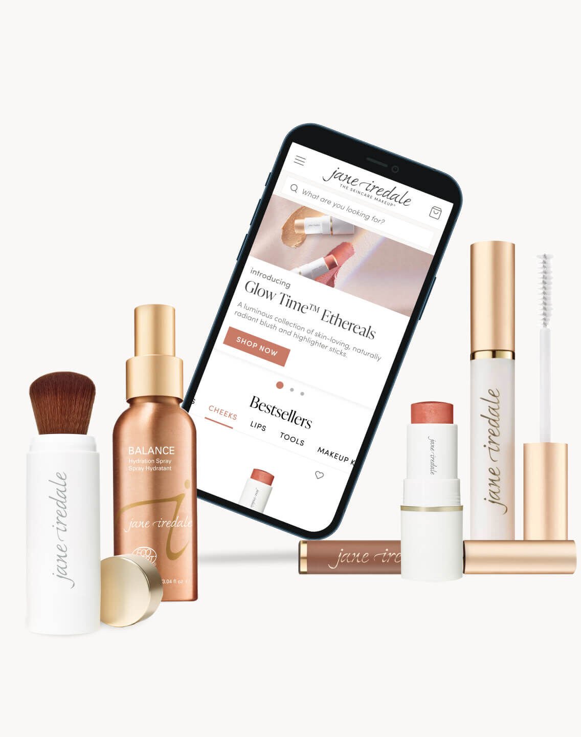
Our mobile first redesign introduced lots of features to improve the user experience.
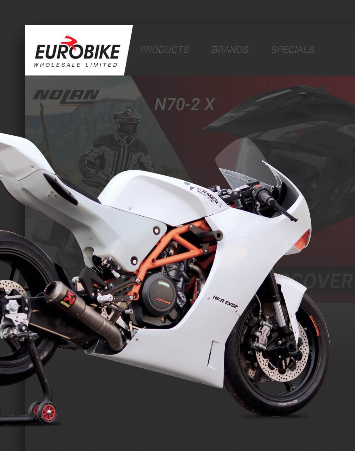
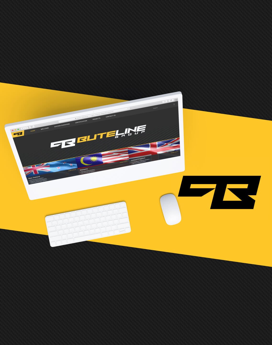
Eurobike has been importing and selling quality bike parts to New Zealand since the early 70s.
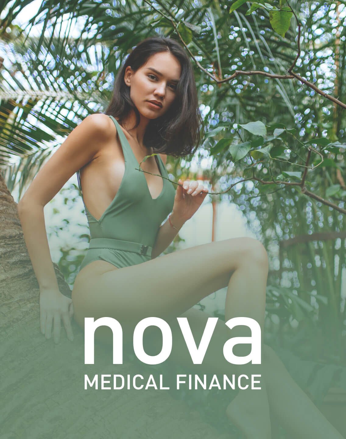
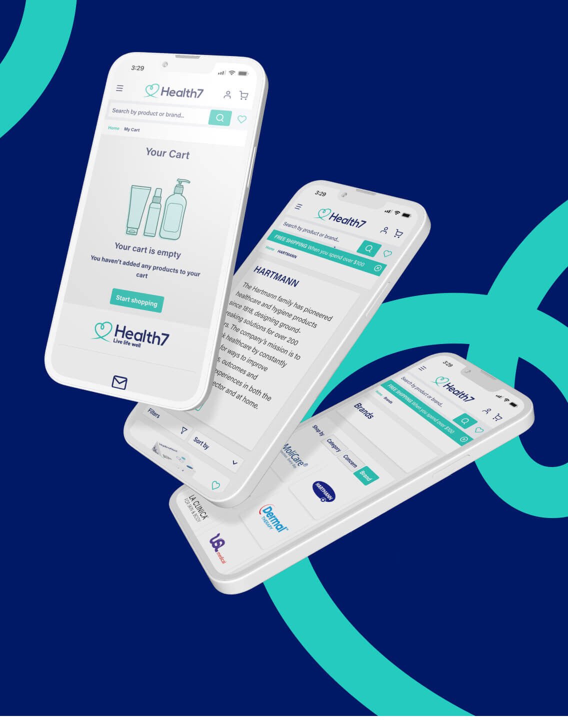
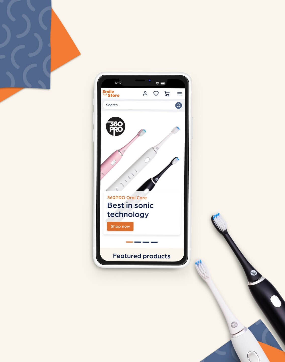
Trusted by 1000’s of Kiwis & NZ Doctors for 15 years.
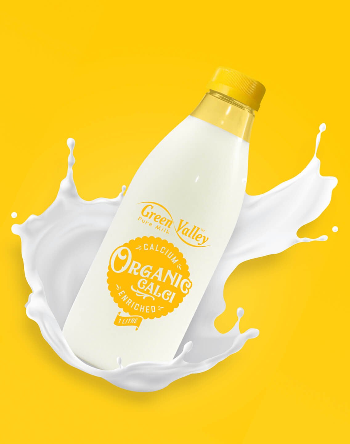
Green Valley is an exciting, innovative company and a leading supplier in the NZ Dairy Industry.
We partner with progressive Kiwi businesses to help bring their brand to life online.


Keith Hay Homes has been working with the 72DPI team now for the past several years. They created a wonderful website for us and are constantly helping with ongoing support and upgrades. They are very professional offering great solutions to all our website requirements. Excellent value and they always complete work fast and meet expectations every time. We would highly recommend the team at 72DPI for all your website requirements.
Keith Hay Homes
Dealing with the team at 72DPI was great. They are absolutely professional and very dedicated in any given task. Their creative and new ideas are on-point and well thought of. Highly recommended.
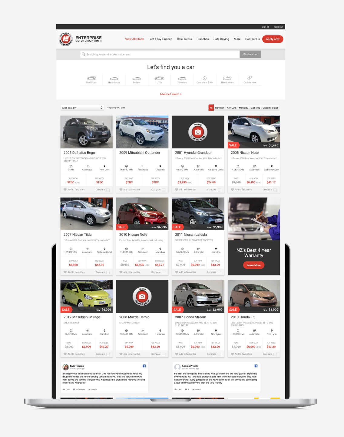
Enterprise Motor Group
72dpi built our site with the best attitude and were very professional. Working with Dipika and Hayden was the best experience. They have been patient and understanding (I am technically challenged) and made the entire process "easy". It was nice to see them as excited about our new website as we were. We are thrilled with the final result!
Dominator New South Wales
While we had our clear objectives in mind, we needed a company who could understand & work with us in an honest, down to earth, real way - ensuring that the end result was something that truly represented us. We found a local, proud NZ company in SeventyTwo who gave us this.
Sales Manager at Green Valley
We have been working with Hayden and his team at 72dpi for well over 10 years. They design, develop and maintain multiple websites on our behalf, as well as create complex bespoke online systems for a variety of purposes. The service we receive and the end-product is always top class.
The Conference Company
Thanks to the 72dpi team for all your help in developing our new website. The site looks fabulous and we're really pleased with how it's working. It's been a breath of fresh air to have a site that can handle all our requirements and gives us the control to easily update content as needed. We really appreciate all your patience with some very tricky technical requirements and making the process as seamless as possible - Hayden was unflappable and has a real wealth of knowledge, so we always felt in good hands. Thanks again for all your work.
Eurobike

I have been working with SeventyTwo for a number of years now and am always impressed with their professional service, attention to detail and the quality of their work. They have taken the time to really understand the various aspects of our business and provide well thought out solutions. They have a fantastic team who always go the extra mile. Highly recommend.
Generus Living Group

The team at 72dpi have been an absolute pleasure to work with. From the initial design phases, right through to post-launch support they have been creative, responsive and patient, and have delivered a top class website that aligns perfectly with our brand. The CMS system is robust and easy to work with and I have had nothing but positive feedback from our team and customers. I would happily recommend 72dpi for your next web project!
Smart Parking
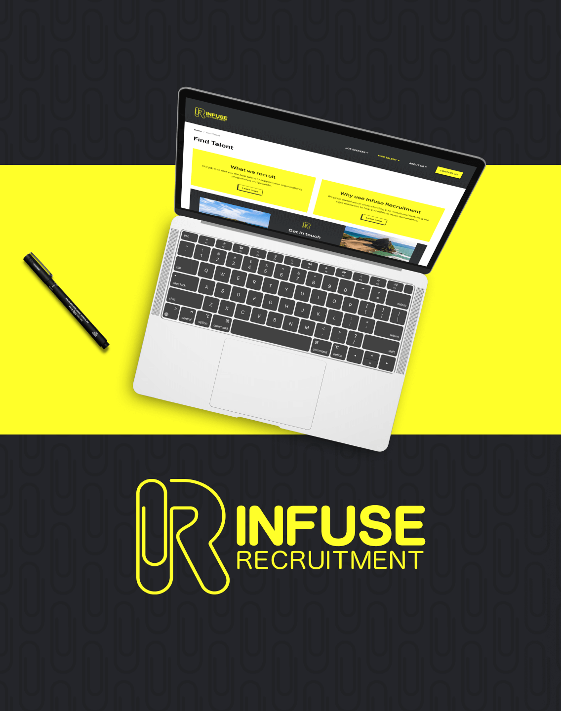
We can highly recommend 72DPI. The team is capable, responsive and able to provide complex web design and development solutions. The team is pleasant and easy to deal with.
Vidak
Awesome team of people, very responsive and proactive.
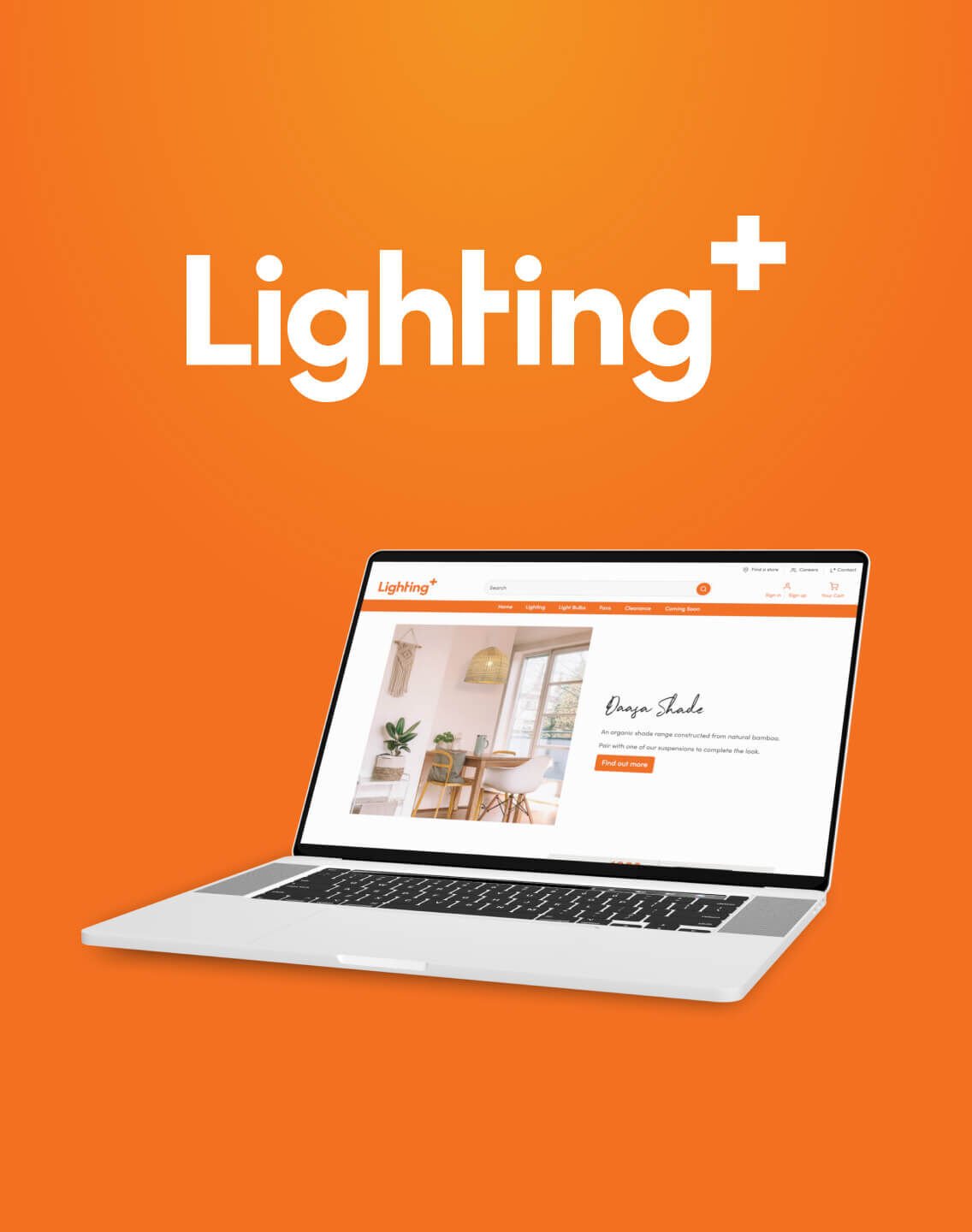
Lighting Plus
The people at 72DPI made creating our consumer facing website an easy process with fantastic communication along the way - we have since gone on to use them for other projects and wouldn't hesitate recommending them! They continue to support our sites with any updates/questions we have and the turn around is super fast. Amazing work, thanks for a great experience and great result.
Marleen Wholesales

Thank you for the great experience 72dpi! Pukekohe Community Action is re-born and updated thanks to you all. We are excited and confident that local families will find out more about us and make the most of the community programs we offer here in Franklin. Your design, build and implementation processes were seamless. Advice, support, tips and service - extremely helpful!
Pukekohe Community Action
Hayden and the team have built more than 5 websites for different parts of our business over the last decade. Their work is fantastic and forward thinking, they are responsive and easy to deal with. We will continue to use them well into the future. I would highly recommend them for any size project.
Enterprise Motor Group
For us at Professional Skin & Beauty, choosing 72dpi to build our website was one of the best decisions we made . A friendly, reliable, professional and easy to deal with company, that respected our values and clearly outlined the process, step by step, start to finish. Not only did they meet all timeline expectations, they also communicated efficiently with our team and continue to provide the resources for ongoing support. I highly recommend 72dpi to anyone looking for digital solutions.
PSB
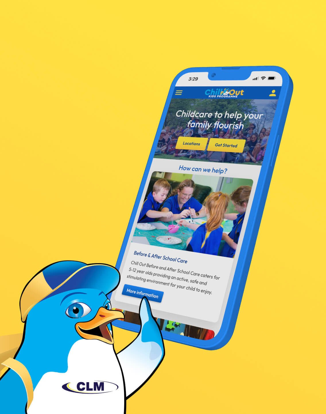
We've been working with 72DPI for many years now. They have developed us an Online Booking System for childcare enrolments that has been leading the way in New Zealand. Friendly team to work with, highly recommended.
CLM
SeventyTwo has been our go-to for web development for over 15 years. We have just launched a new website and brand refresh which they handled from end to end. We are quite a unique business and they managed to provide a us a fully customised site that is far better than we could have dreamt up ourselves - and all this without us developing an overly specific brief. The new site has eliminated the need for us to have a separate CMS, and the efficiency gains have been huge. We estimate to have reduced admin time by 90% which has lowered our overheads significantly! They really put the time into thinking about how the site will actually be used, and our customers are sending us nice feedback. We have a renewed enthusiasm for our business. Thanks SeventyTwo.
Director - Customer Experience at Nova Medical Finance
Hayden, Dipika and Jamie are fantastic to work with! Very clever and always out to help. They care about our websites as much as we do. Thanks team.
NuRange

Hayden, Keith, and the team at 72dpi are excellent to deal with. They combine technical expertise with strong design skills and are approachable, responsive and service oriented. I have worked with 72dpi on several projects over the last five years and can highly recommend them.
Bullseye
We decided to work with Hayden and his team to redevelop our business website a few years ago and have recently done some significant upgrades. They are always professional and get things done quickly.
Carlielle Kitchens

I have worked with Hayden and the 72dpi team for over 5 years. I keep going back as, beyond great design and development work, they deliver top notch service support. Jamie is a very talented web designer. Even when things go wrong at inconvenient times, Hayden and the team are there to fix things when you most need it.
InsideOutWorks
We've used 72DPI for a number of years now and they are extremely efficient and friendly to work with. I highly recommend them.
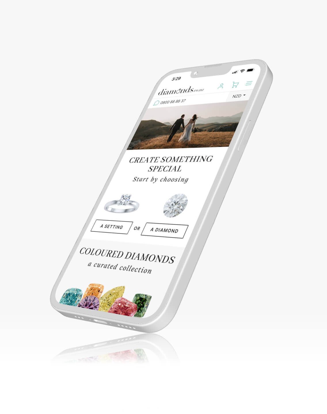
diamonds.co.nz
72DPI have done a fantastic job designing and constructing our website. We highly recommend them.
The Surveying Company

We have a mutual client with 72DPI and every interaction we have had with the team has always been a positive experience. Great customer service and solid, speedy digital development and deployment of the work.
Libby & Ben
Cavalry Marketing & Design has been working with the team at 72DPI since the start of 2014 and I wish we had found them sooner. As our web development partner they provide so much value to all of our web projects and they are exceptionally easy to work with. Their CMS is the best we have ever used and their marriage of technical and design skills is very strong. I wouldn't hesitate to recommend them to anyone looking for an outstanding outcome to any web project.
Cavalry
We recently had the pleasure to work with Hayden, Dipika, Jamie and the team at 72 DPI for the re-development of our ageing and under-performing website. We have dealt with various web design companies in the past, but the team at 72DPI stood out for us in terms of customer service and overall expertise. We are very pleased with our new site and the greatly improved Analytics over even a short time are testament to the experience that 72DPI bring to the table. We are now a loyal 72DPI customer.
CoverCorps

Highly recommend the 72DPI team. Hayden, Dipika and Jamie are a pleasure to work with! Excellent communication on web and creative projects, always available to help. Thanks Team!
Fresh Slice
I have always found Hayden, Dipika and all the team and SeventyTwo to be timely, responsive and understanding of all my requests for our website management and upkeep, as well as during the process of the new website implementation. I would definitely recommend this team.
Active Plus
If you’ve got a big idea or a new project in mind, we’d love to help. Let’s chat.