The Mission
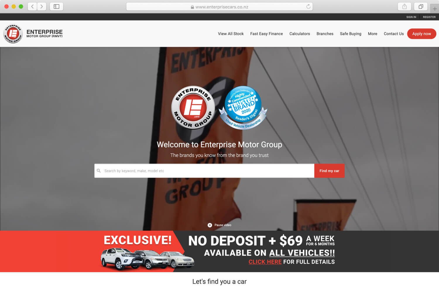
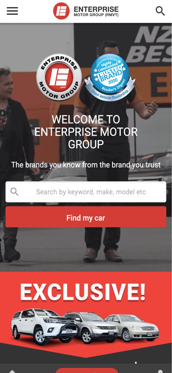
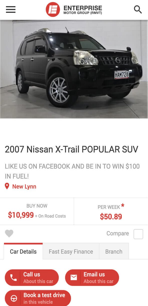
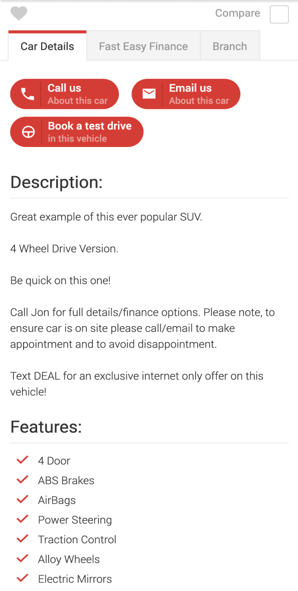
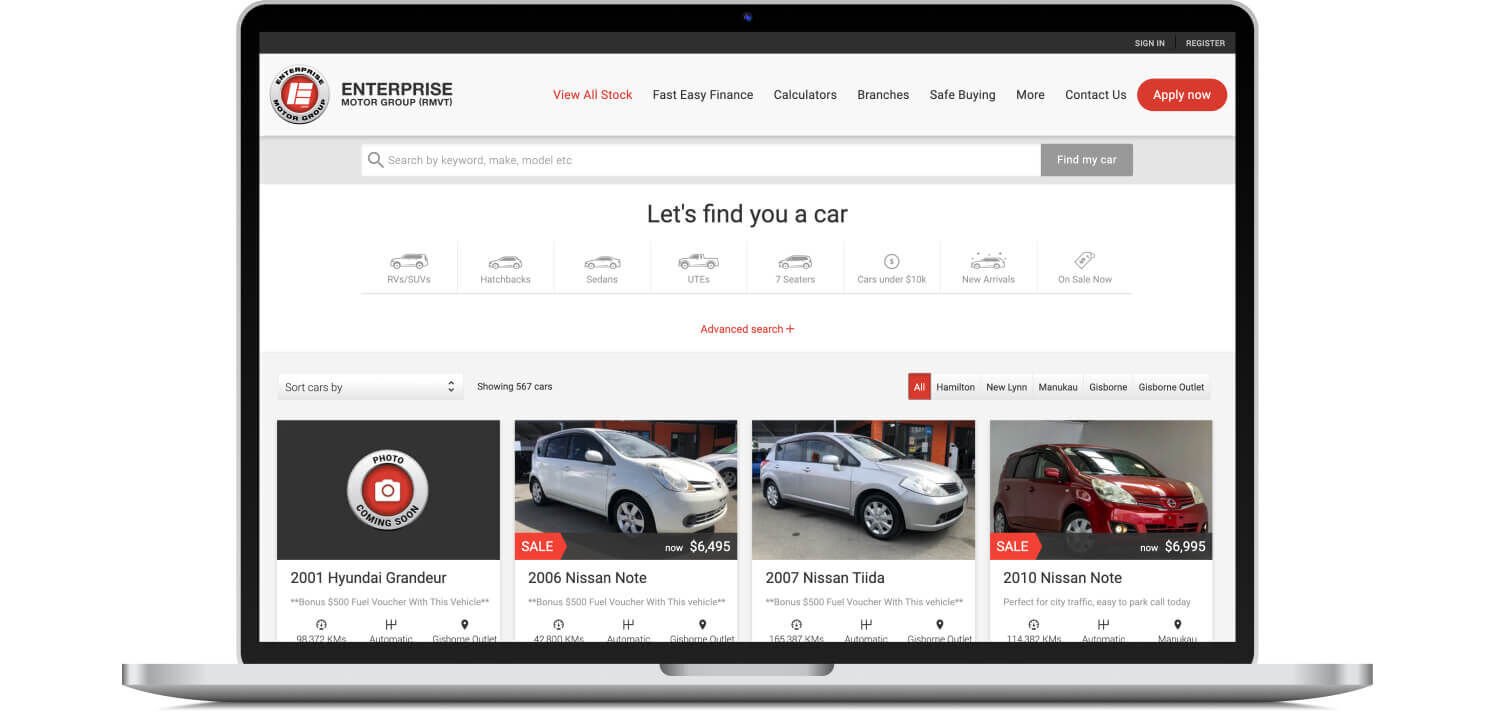
Before we launched the new site we had been maintaining a mobile website and a desktop website for the client. A dedicated mobile website was not uncommon 5+ years ago but we had recommended a move towards a fully responsive website and the client was onboard with this and was actually very much in favour of a mobile first approach.
For a number of years we had been making advances in the usability and quality of the mobile website. This was motivated by analytical data that showed a growing audience of users searching for vehicles on the Mobile website. At a certain point the mobile website performed and looked better than the desktop website which was the catalyst for this redesign.
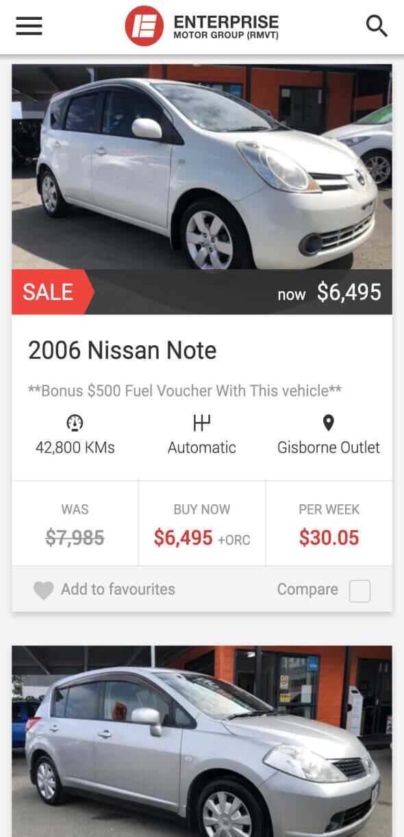
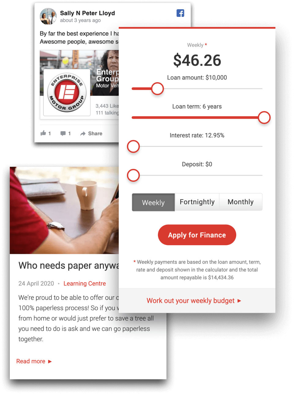
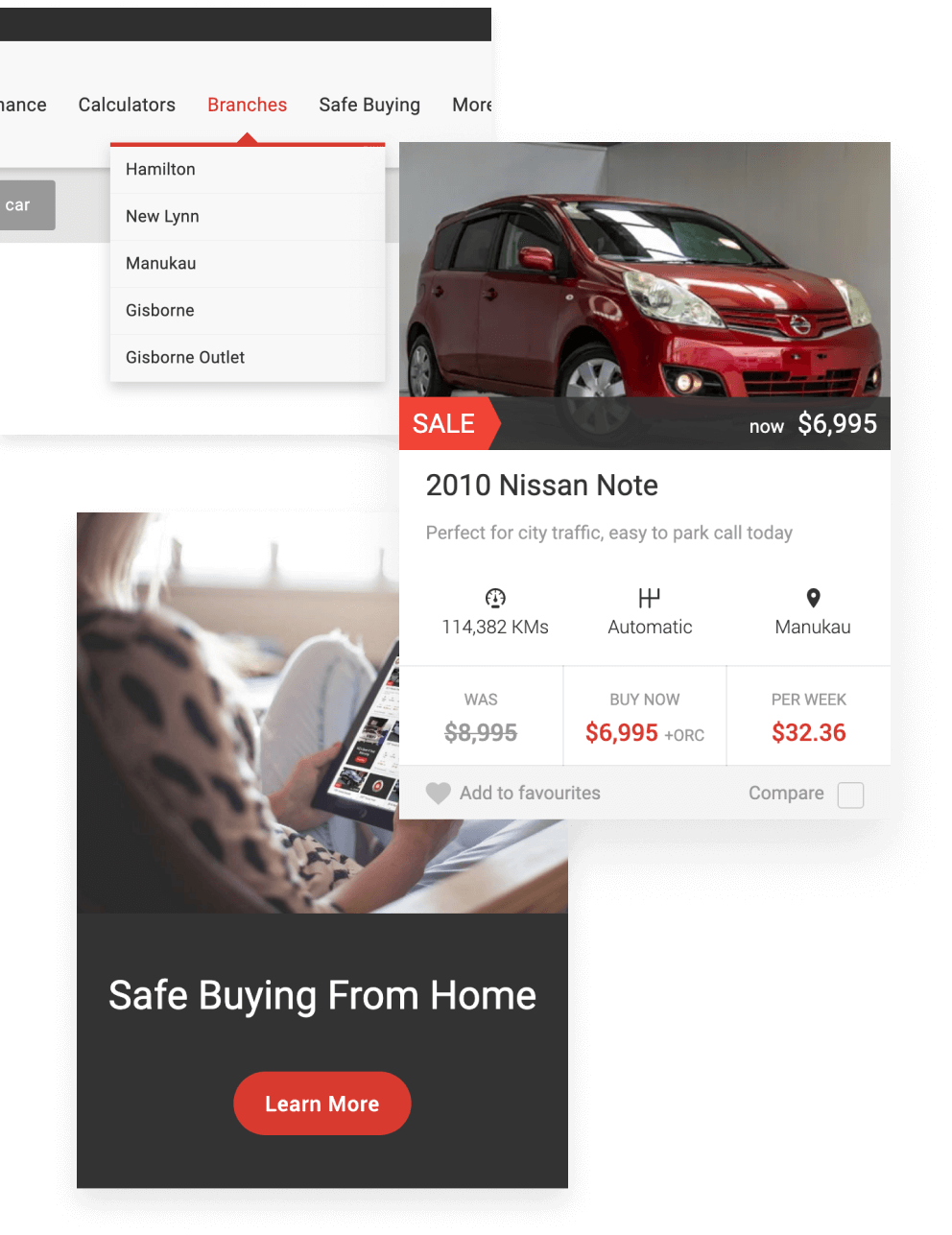
Our mission was to create a user experience that was seamless across all devices. We had to make it simple to perform detailed searches for vehicles, we also wanted to make the browsing of vehicles more informative with a UI that utilised cards in such a way that the key features of vehicles were always present.
We were also tasked with simplifying the Application Form process; we knew we could make improvements to the layout, structure and logic of the form that would remove pain points for the customer and also help the client process the applications and ultimately convert more applications to paying transactions.
