The Outcome
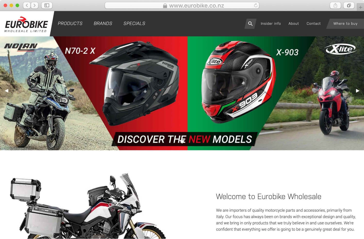
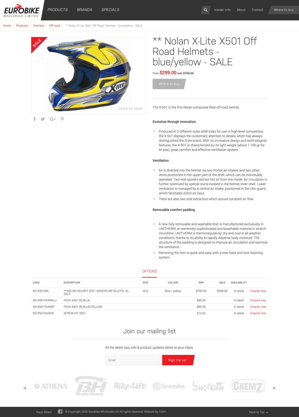
We completely redesigned the Eurobike site. The new aesthetic was created to complement the existing brand while giving the site a fresher, modern edge. Instead of shades of grey we went for bold colour fills with better contrast for text elements.
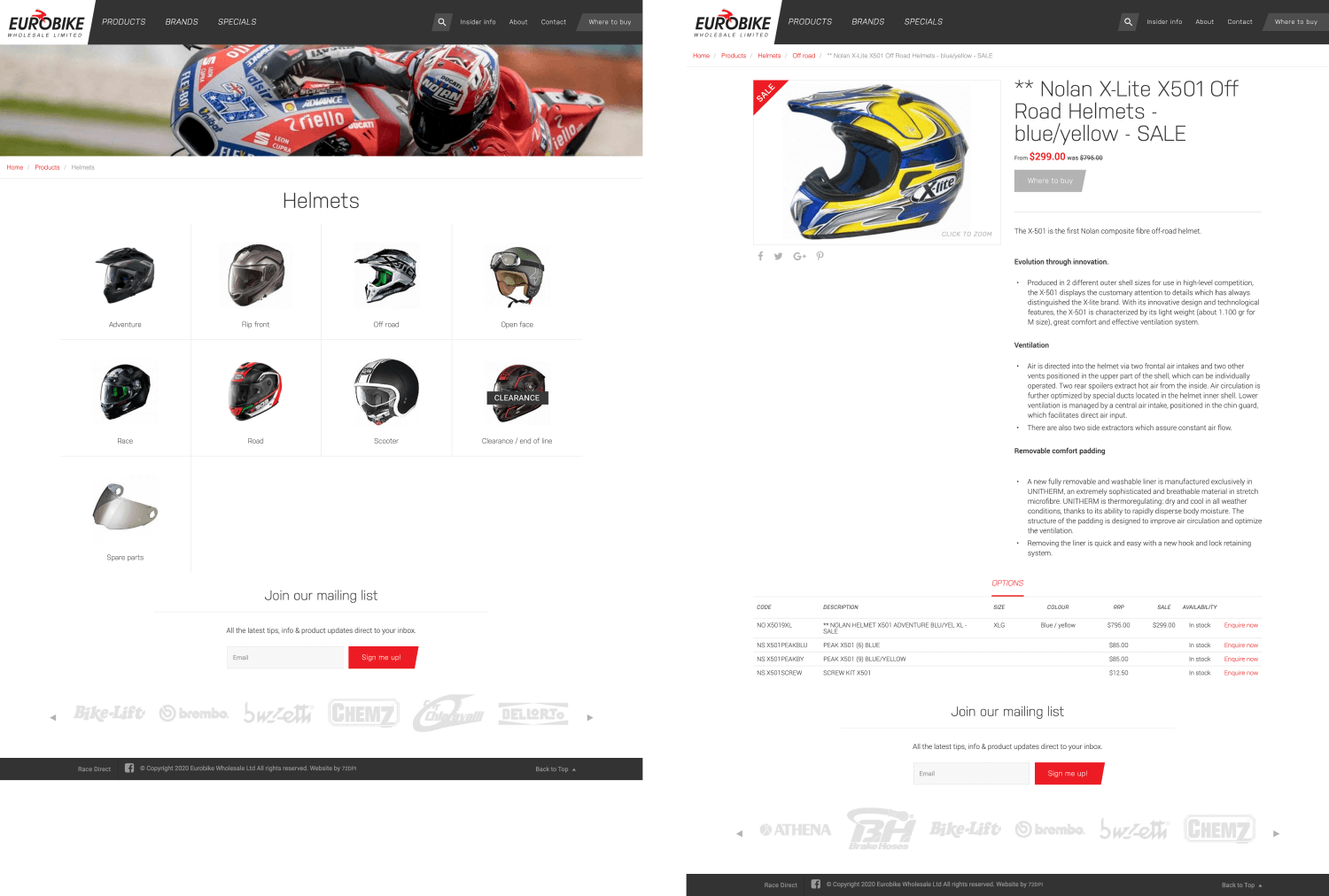
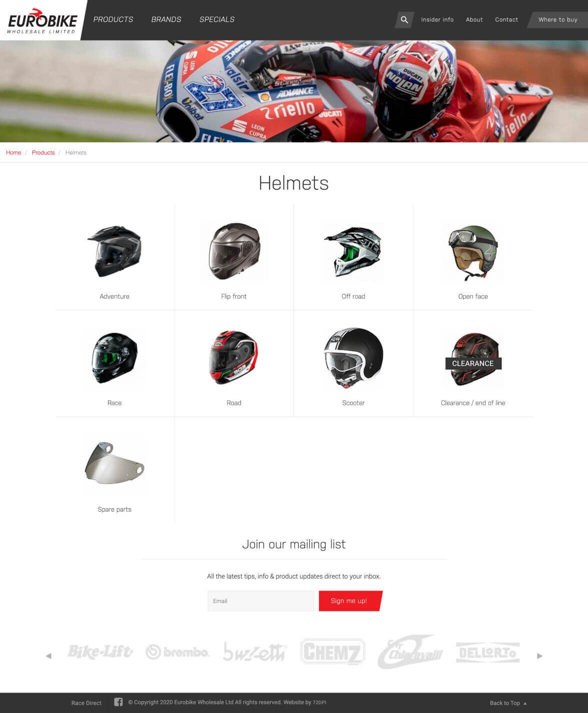
Working with the client we re-structured the site and product catalogue to prioritise the content that is most important to their customers. We gave their product brand content a much needed make-over, adding more detail that would be useful to clients.
We gave product specials their own space so that it was easy for customers to find and was also a better platform for the Eurobike team to run promotions.
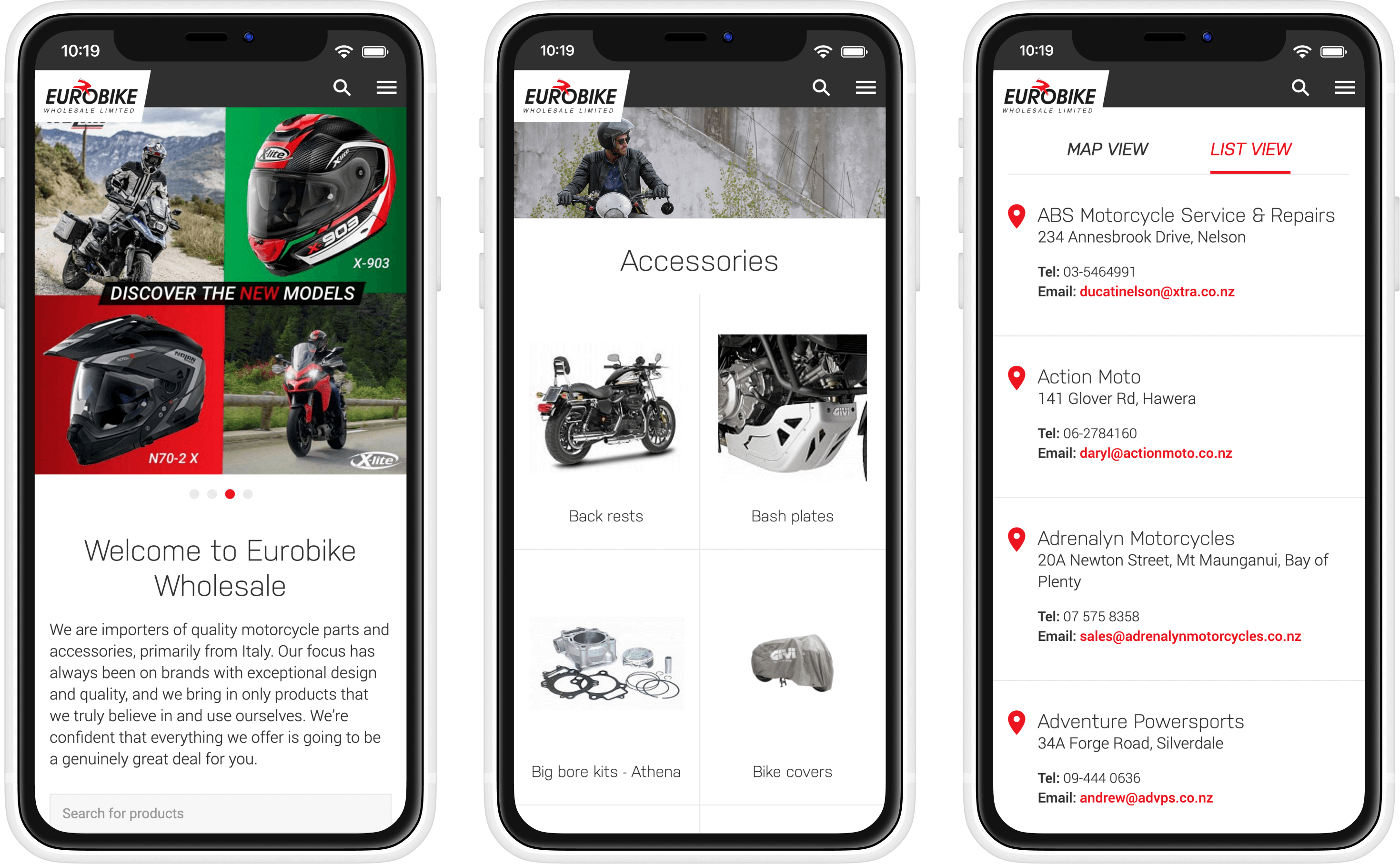
Eurobike pride themselves on the extensive dealership network they have worked hard to build up over the years. We highlighted this with a call to action in the header of the site and improved the user experience in filtering the dealers to make it simple to find the nearest store with your stocked item.
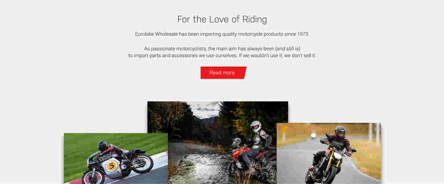
Finally we wanted to celebrate the heritage of a company that has been faithfully serving kiwis for over 40 years. We created pages that tell the history of Eurobike and added personal touches like meet the team pages.
Eurobike’s authenticity and expertise in all things bike related also shines through in the new blog, Insider Info, that we created. This gives the team an outlet to share their passion and extensive experience. This has become a real asset and further underlines their expertise, helping build brand loyalty and following in the New Zealand biking community.
