Nova Medical

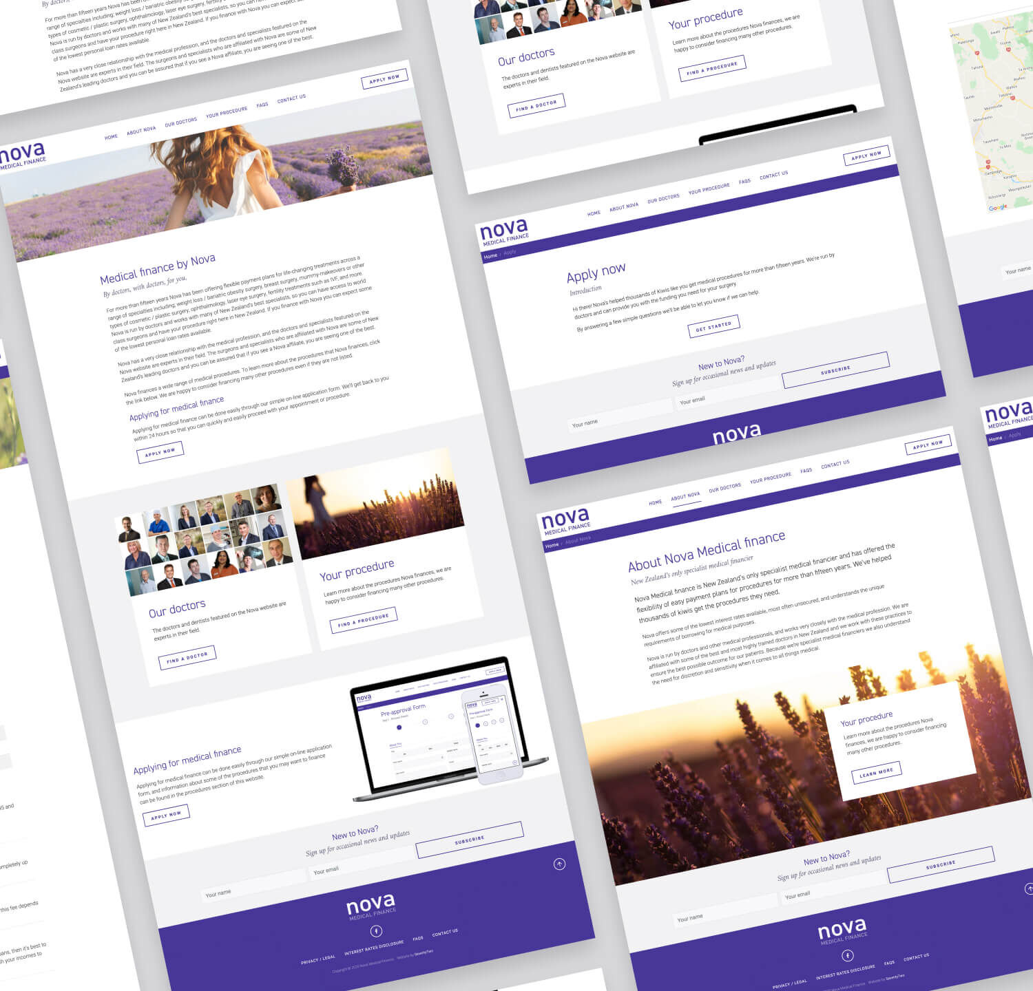
For more than fifteen years Nova has been offering flexible payment plans for life-changing treatments, SeventyTwo has been part of that journey from the very beginning. In 2020 we went live with a fully redesigned website. The old website had served this client well for many years but the redesign was long overdue.

The Mission

Before we launched the new website this business had been operating with a website we had designed them 15 years ago. The site was built on a very early version of our CMS but was still performing well and functioning as it should.

Having said that the aesthetic was looking a little dated and the site was not fully responsive.

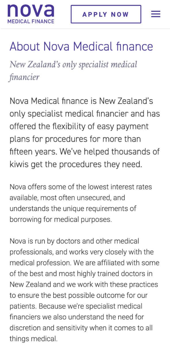
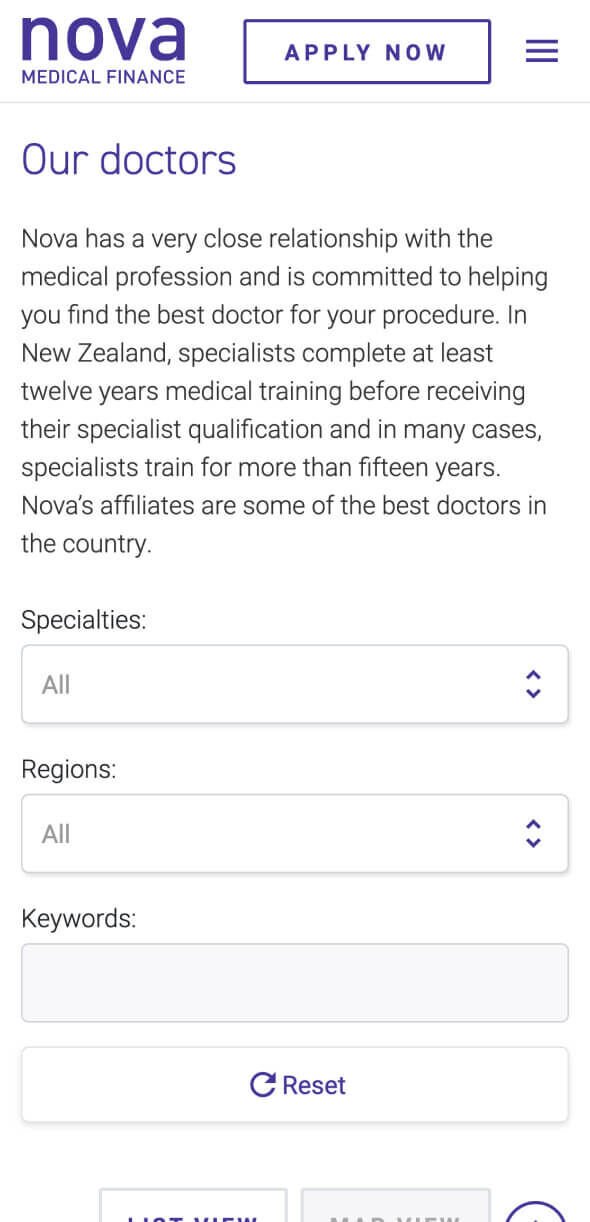
We were tasked with bringing this website into the 21st century in terms of aesthetic, ensuring that the site was fully responsive. We had clear direction from the client on exactly who their target market was and how the existing website was not appealing to this important demographic.

Another major aspect of the redesign was addressing some of the clunkier steps in the application form. We’ve had a lot of experience in improving and simplifying online forms. The client was looking for ideas here on how we could make the process of applying for finance easier for their users.
The Outcome

We approached this project on 2 fronts; the styling and layout of the site itself and the form design.

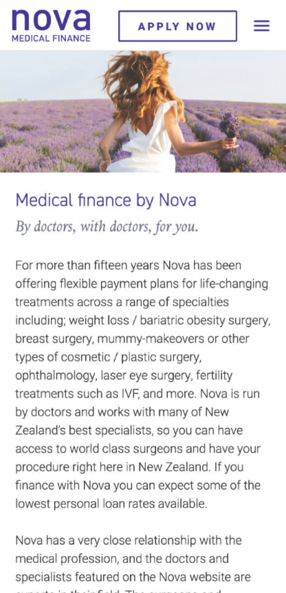
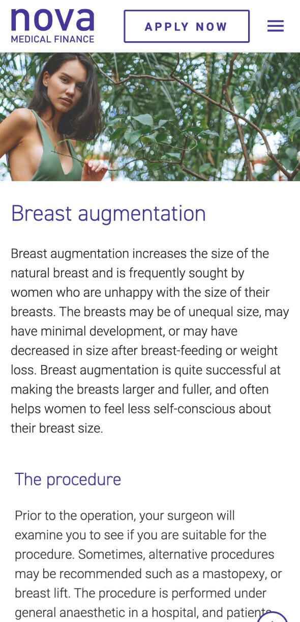
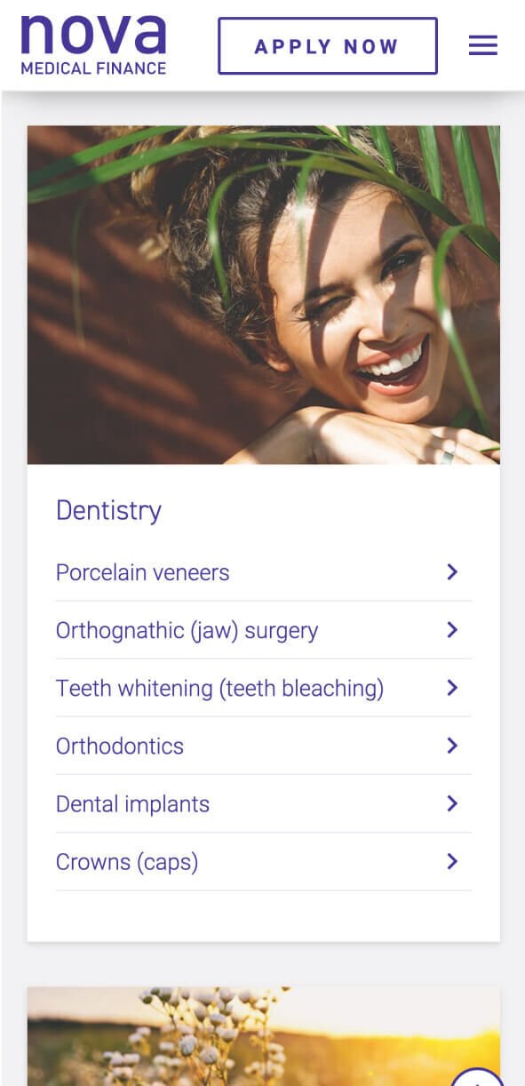
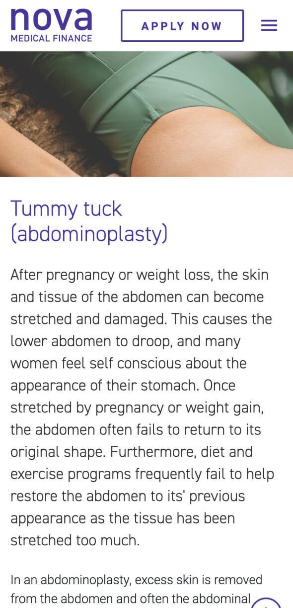
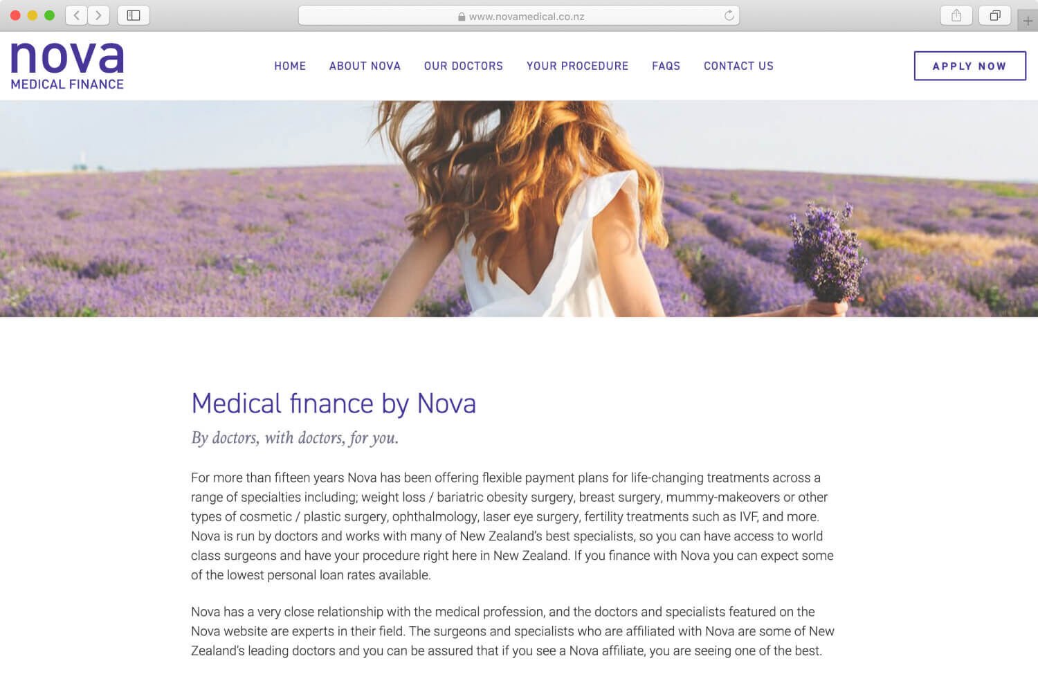
Our approach to the overall aesthetic was a softer, more femine look. The client had highlighted women in their 30-40s as a key demographic, especially women who had gone through one or more childbirths and were not happy with how their bodies had changed. Art Direction was important here as we wanted to communicate a calming, emotive quality to the layouts through the Stock photography and colour palette. The brand purple was quite saturated so we balanced this with neutral colours and photos that had a softer feel.

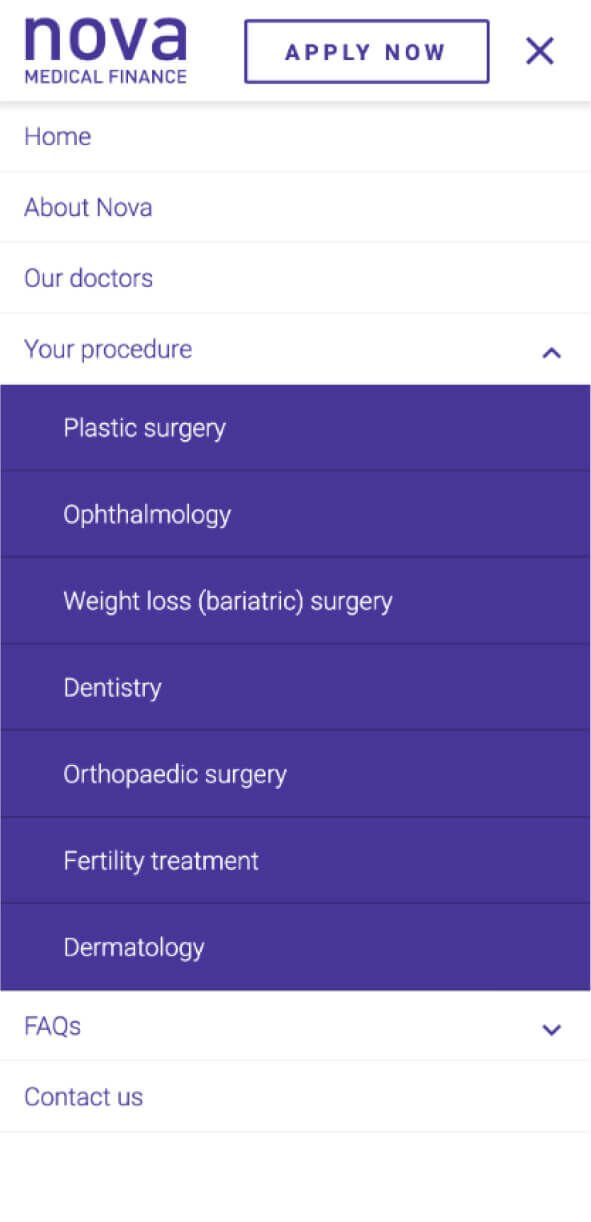
We addressed a number of issues with the Application process which had been highlighted in the initial scoping phase of the project. First we made the application process personal by crafting copy that spoke to the applicant and led them through the steps. We kept the four steps of applying but made this clearer in the UI so that applicants knew exactly how far into the process they were. We made lots of improvements to the form structure and UI such as repositioning the form labels above the fields so these were easier to read. We used more appropriate fields and elements such as toggle buttons to reduce the number of clicks required to make selections. Lots of little improvements like this made a big difference.

Our team also addressed some of the clunky form logic and bad UX by prototyping and testing out different strategies to see what might work better. We have a lot of experience in this type of work and we threw all of our knowledge into this form to deliver something that looked good but was great to use.

The Impact

It’s great to have a website that looks good but if your business relies on sign-ups or form submissions you need to have a carefully planned and well executed form. That only comes with experience, attention to detail and an understanding of user needs.

We listened carefully to the client and were able to expand on the information captured by the form without complicating the process. The form redesign alone has greatly improved their business. We addressed a number of pain points for the client with the new form, with the CMS handling the submissions and sending out automatic responses and updates freeing up time for the Nova team.

The fresh new look has been well received and has instilled confidence in the brand in their target audience which is important when customers are going to be applying for large sums of money.

We will continue to work alongside Nova Medical, monitoring the data we receive via the CMS and Analytics to look for ways we can further improve the Application.

iPhone The Impact 1

Services

  • Project Planning & Management
  • Content Strategy
  • Wireframing
  • Prototyping
  • User Experience Design (UX)
  • User Interface Design (UI)
  • Front-end Development
  • Ongoing CMS customisation & support
iPhone Services 1

SeventyTwo has been our go-to for web development for over 15 years. We have just launched a new website and brand refresh which they handled from end to end. We are quite a unique business and they managed to provide a us a fully customised site that is far better than we could have dreamt up ourselves - and all this without us developing an overly specific brief. The new site has eliminated the need for us to have a separate CMS, and the efficiency gains have been huge. We estimate to have reduced admin time by 90% which has lowered our overheads significantly! They really put the time into thinking about how the site will actually be used, and our customers are sending us nice feedback. We have a renewed enthusiasm for our business. Thanks SeventyTwo.

Nova Medical Finance

Director - Customer Experience at Nova Medical Finance

Next case study Previous case study Previous case study

We love a challenge

If you’ve got a big idea or a new project in mind, we’d love to help. Let’s chat.

Start the conversation